White paint seems simple — until you actually try choosing one.
What should be the easiest color decision in the world somehow turns into comparing names like Chantilly Lace, Swiss Coffee, Simply White, and Decorator’s White while staring at tiny paint chips that all look… exactly the same.
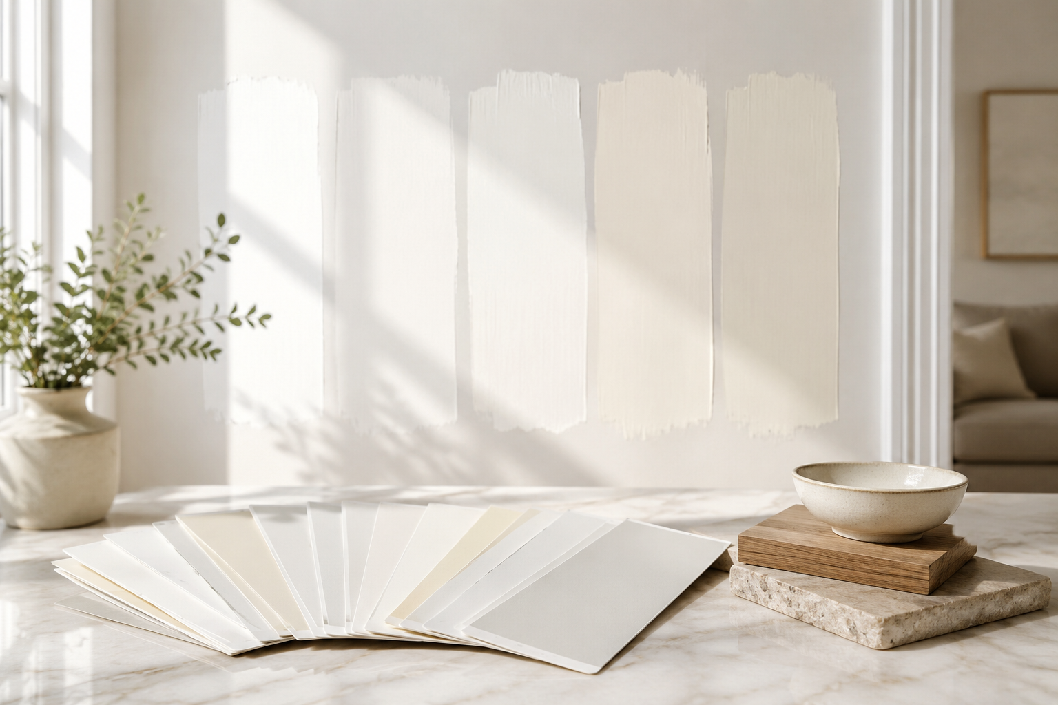
And yet once they’re on the wall? Completely different story.
One white can make a room feel crisp, bright, and expensive. Another can suddenly look yellow, gray, dull, or strangely “dirty” — even when the walls are freshly painted.
So what’s actually happening?
The answer usually comes down to one surprisingly important factor: undertones.
White Paint Isn’t Really “White”
Most white paints contain subtle undertones hiding beneath the surface. Those undertones may lean:
- warm
- cool
- creamy
- gray
- beige
- blue
- green
- even slightly pink
At first glance, they’re hard to notice. But once natural light hits the walls — especially throughout different times of day — those undertones become much more visible.
That’s why one white can feel clean and airy while another suddenly feels muddy or outdated.
Lighting Changes Everything
Natural light has a huge impact on white paint.
A color that looks bright and fresh in a showroom can appear completely different in your actual home depending on:
- window direction
- surrounding landscaping
- flooring colors
- ceiling height
- nearby furniture
- even the weather outside
North-facing rooms tend to bring out cooler tones, while south-facing spaces amplify warmth.
That creamy white you loved online? In the wrong lighting, it may start looking yellow by late afternoon.
The “Too White” Problem
Ironically, some whites look dingy because they’re too bright.
Ultra-bright whites can create harsh contrast against trim, cabinetry, flooring, or softer furnishings. Instead of feeling clean, the room can feel cold or unfinished.
This is especially common in homes with:
- warmer wood tones
- beige tile
- cream countertops
- older lighting fixtures
A softer white with balanced undertones often feels more natural and timeless.
Why Trim Can Suddenly Look Dirty
Here’s something many homeowners notice after repainting walls:
Suddenly the trim looks old.
That doesn’t necessarily mean the trim paint is bad. It may simply be that the new wall color changed the contrast in the room.
Fresh whites can expose:
- aged paint
- yellowing from sunlight
- sheen inconsistencies
- old touch-ups
- accumulated wear
This is one reason professional painters often recommend evaluating walls, ceilings, and trim together instead of separately.
Sheen Matters More Than People Think
Even the finish of the paint changes how white appears.
Flat finishes absorb more light and tend to feel softer. Higher sheens reflect more light, which can make whites appear brighter — or highlight imperfections.
A clean-looking white in an eggshell finish may suddenly feel stark in semi-gloss.
That’s why selecting the right sheen is just as important as selecting the right color.
The Best White Paint Usually Isn’t the Trendiest One
One of the biggest mistakes homeowners make is choosing white paint based solely on photos online.
The “perfect white” is highly dependent on the home itself.
The best white is usually the one that:
- works with your lighting
- complements fixed finishes
- balances surrounding colors
- feels consistent throughout the space
- still looks good morning and evening
In other words: context matters more than trends.
Final Thoughts
White paint may look simple, but it’s one of the most nuanced color choices in a home.
The difference between a white that feels crisp and elegant versus one that feels dull or dingy often comes down to subtle undertones, lighting, contrast, and finish selection.
And once you start noticing those differences… it’s hard to unsee them.
If you’ve been staring at paint samples wondering why no two whites ever seem to look the same, you’re definitely not alone. The right color can completely transform how a space feels — brighter, cleaner, warmer, more modern, or more inviting.
At Southington Painting, we help homeowners choose colors that work beautifully with their lighting, finishes, and overall style — not just on a tiny paint chip, but in real life.
Ready to refresh your space with a white that actually looks the way you want it to? Contact us today to schedule your free estimate.