Have you ever wondered why some places just seem to bring about that certain feeling?
You know, maybe one room feels light and cheery, while another is somber and relaxing? If so you are not alone, and there is actually a very specific reason. The colors we surround ourselves with have a profound impact on our mood and behavior, a concept central to the subject of “color psychology.” This fascinating area of study is not just for theoretical thinkers. It offers valuable insights for homeowners looking to create spaces that not only look beautiful but also give rise to desired emotional responses. Let's take a deeper look at this crucial aspect of interior painting!
What is Color Psychology?
To put it briefly, color psychology looks into how different shades of color can trigger various emotional and physiological reactions.
Each color has unique properties that influence our feelings and behaviors, and while color psychology is not an official branch of medicine, it is a well recognized area of study that helps us see the relationship between the two. What does that mean for interior designers? The ability to pick to perfect color!
Colors for Energy
Coffee is not the only way to keep yourself focused and alert. Did you know that warm colors are also known for their stimulating and invigorating effects? There are two color palettes in particular you should keep in mind if you're looking to enliven your space:
Light Reds: Red is a highly visible color that can grab attention quickly. It's often associated with strong emotions like passion, excitement, and urgency. Want to stimulate conversation over the dinner table? Give your dining room a fresh coat of crimson red.
Oranges: The great thing about orange is that it combines the excitement of red and the happiness of yellow, so if you can’t choose between the two, this is the palette for you. Ideal for creative spaces like offices or studios, an orange shade will create an environment you won't want to leave.
Cool Colors: For Quietness and Relaxation
Everyone needs a place to unwind and relax, but not every environment is a suitable place to do so. So what is it that can make an ordinary home into a kind of calm sanctuary? A cool color palette.
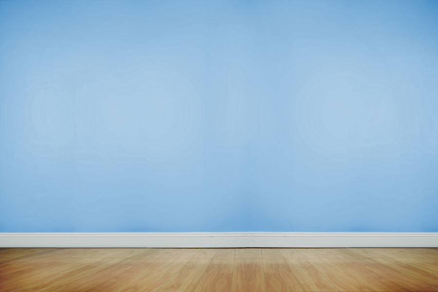
1. Blue, the color of the sky and sea, is widely acknowledged for its serene qualities, making it a perfect choice for bedrooms and bathrooms.
2. Green, reminiscent of nature, promotes comfort and tranquility, ideal for home offices or study areas.
3. Purple, especially in lighter shades like lavender, can bring a sense of luxury and peacefulness, suitable for bedrooms or lounges.
The Impact of Color in Specific Rooms
The choice of interior paint colors don't only have an effect on mood, they can also significantly alter the functionality of specific rooms. For example, it may be nice to have a vibrant yellow in a room where you socialize or are especially active (like the kitchen, dining room etc.), but when it comes to bedrooms and other areas of rest, it would probably be better to choose a cool and relaxing shade.
What’s the Takeaway?
Understanding color psychology is crucial in interior design, as it influences the mood and utility of your living spaces. By carefully selecting colors, you can create environments that reflect your personal style and meet your emotional needs.
Planning to repaint your home and want to create the perfect mood in each room? Contact Southington Painting for expert color consultation and professional painting services. We are here to help!
Q: How can I tell which color will work best for my specific room? A: Consider the room’s purpose, lighting, and size. Light colors can make a small room feel larger, while dark colors add coziness to a spacious area. Think about the mood you want to create - calming, energizing, or warm and inviting.
Q: Can I mix warm and cool colors in one room? A: Absolutely! Mixing warm and cool colors can create a balanced and dynamic space. Just ensure there's a cohesive element, like a consistent undertone or color intensity, to tie the room together.
Q: Are there specific colors to avoid in certain rooms? A: While personal preference is key, some general tips include avoiding overly stimulating colors like bright red in bedrooms and very dark colors in small rooms, as they can make the space feel cramped.
Q: How does lighting affect the appearance of paint colors? A: Natural and artificial lighting can significantly impact how a color looks. It’s always a good idea to test paint samples in the room at different times of the day to see how the color changes with the light.
Q: Is it okay to use trendy colors, or should I stick to classics? A: While trendy colors can make your space look current, it's important to choose hues that you'll enjoy for years. If unsure, incorporate trendy colors through accents that can be easily changed, and use classic colors for larger areas.